John Lewis
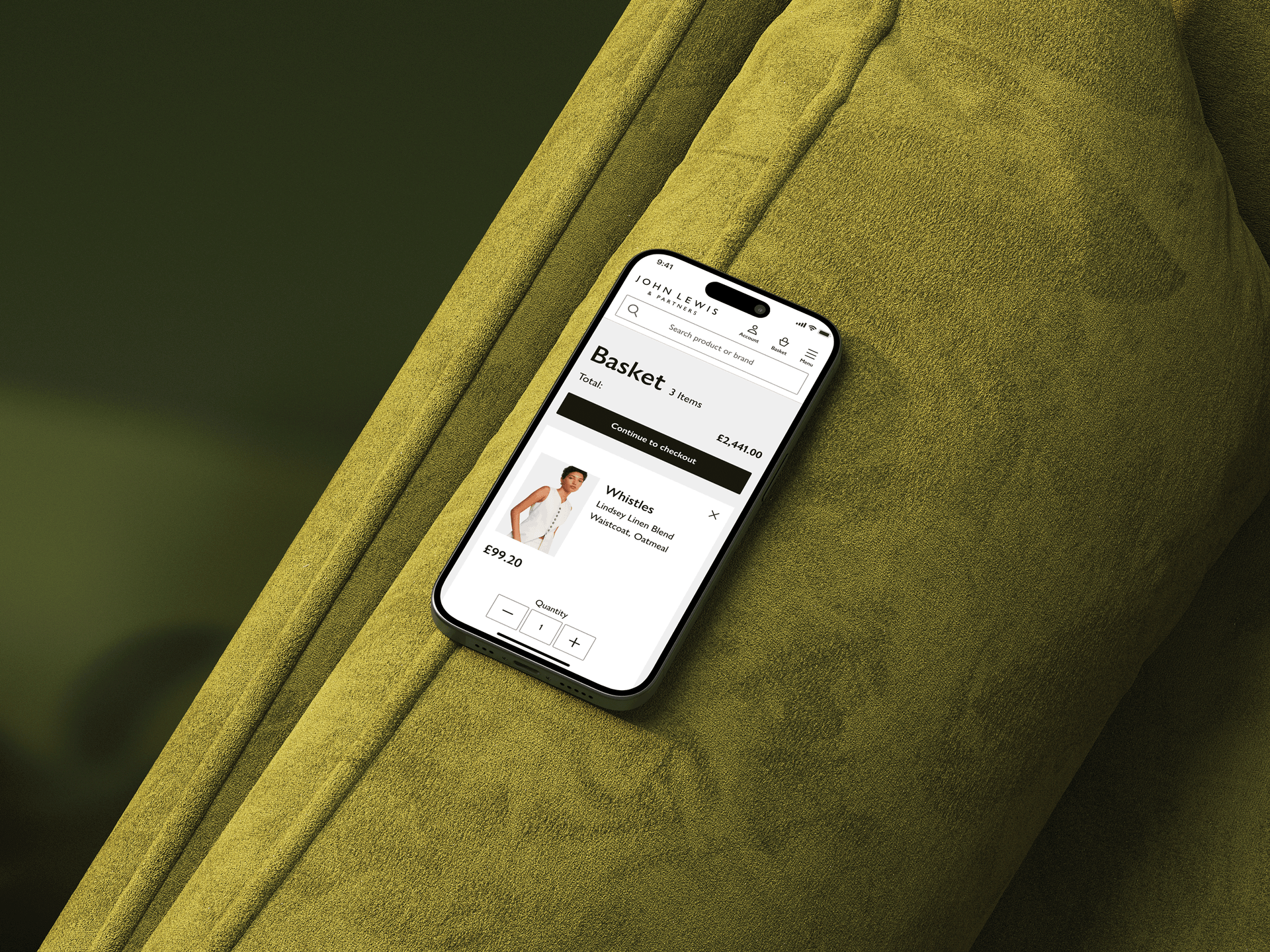
Optimised e-commerce shopping basket experience to boost customer conversions.
Impact
+0.7%
Conversion rate
+1.2%
New visitor conversions
+0.6%
Continue to checkout
-0.4%
Basket abandonment
Strategy
To focus on building a basket experience that is not only efficient but also highly personalised, intelligent, and seamless across all channels.Transform the basket from a simple transaction list into a conversion optimisation hub that builds purchase confidence and reduces friction.
Business goal
The business's core objectives are to enhance user engagement, optimise the shopping process, and boost conversions
Customer goal
The underlying reason why customers use a product or service. It's about understanding the job they're trying to get done. Efficiently find and purchase desired products. Make informed decisions about product choices. Customise their shopping experience to meet specific needs.
The heroes of this story
While analysing basket behavior, we discovered that different customer types hit the same obstacle:incomplete product information,but for very different reasons. The common thread: All three groups were forced to leave their basket to find information that should have been right in front of them.
The Browsers (Explorers)
'Wait, does this come in navy too?' They're spontaneous and impulsive, but the moment they spot an item in their basket and can't remember if there was another color option, they bounce back to the product page. Often, they get distracted and never return—converting casual interest into abandoned baskets.
The Researchers
'I need to double-check the dimensions before I buy.' For higher-value purchases, they need reassurance. When technical specs aren't visible in the basket, they navigate away to verify details. This back-and-forth erodes confidence and increases the likelihood they'll abandon to 'think about it.'
The Bargain Hunters
'Is this the best price for this size?' They're comparing options constantly. Without clear size/color availability and pricing in the basket, they navigate away to check if a different variant offers better value. Each navigation is a chance to lose them to analysis paralysis.
Research highlighted frustrating limitations in the existing journey
This ambiguity impacts confidence prevents customers from making quick, assured purchasing decisions and stalls the path to checkout.
Product information blindness
Imagine reaching a crucial crossroads only to find the signpost missing. That's the frustration of incomplete product details, forcing shoppers to abandon their basket and embark on a separate, often fruitless, search. This detour can easily lead them away from their intended purchase.
Limited editing functionality
The inability to modify product choices directly within the basket frustrated users, forcing them to start over if they needed to change size, colour, or quantity.
The shadow of doubt
When vital product information is missing, confidence crumbles. This lack of clarity casts a shadow of doubt over potential purchases, preventing users from making swift and assured decisions, ultimately stalling their journey to checkout.
Defining the problem
Customers are abandoning their shopping basket with impacted confidence to make purchase decisions.
Customer Behaviour
Customers frequently leave the basket to search for additional product details, and changing product variant, creating friction that disrupts the checkout flow.
Root Cause
Current basket doesn't provide clear informations or editing functionality, forcing users to navigate away at a critical decision point.
Goal
Enable users to access sufficient product informations and editing functionality directly in the basket, eliminating the need to leave and creating a seamless path to purchase.
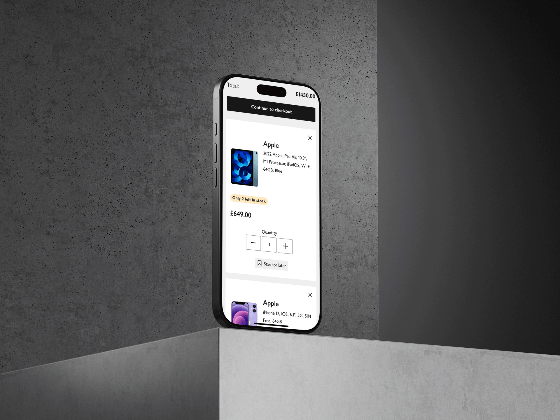
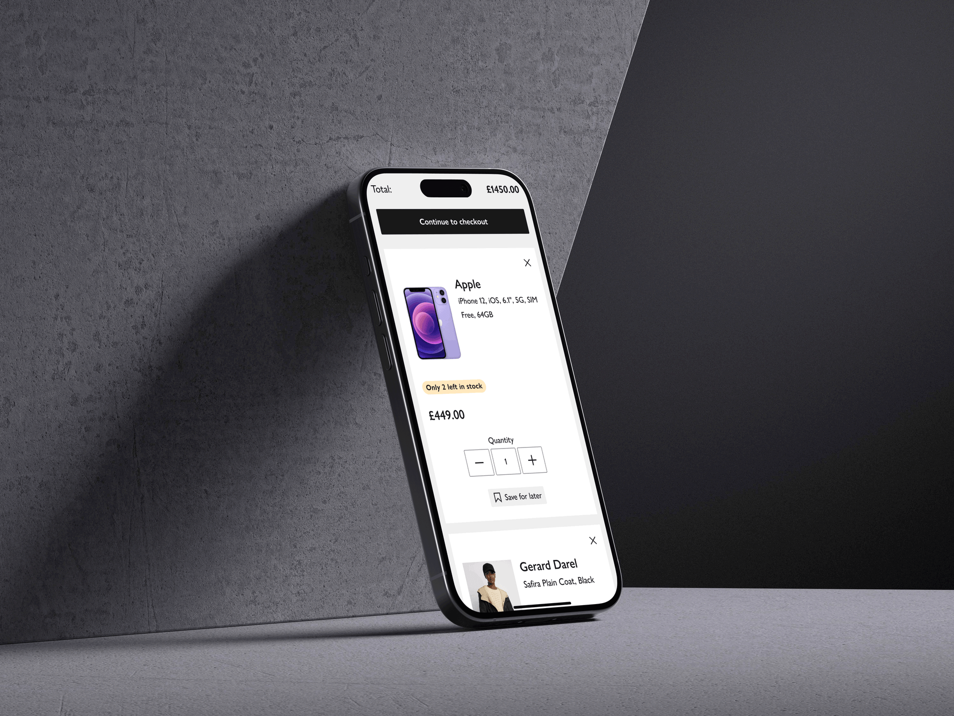
Customers hire our product to get something done
I focus on the underlying reason why customers use a product or service. It's about understanding the job they're trying to get done.
Efficiently find and purchase desired products.
Make informed decisions about product choices.
Customize their shopping experience to meet specific needs.
Hypothesis formulation
Placing customers in control of their shopping experience is key. We can empower them to make quick, informed decisions and modify selections with ease by integrating detailed product information and advanced editing functionalities within the shopping basket we'll be able to improve their confidence and help them move to checkout without starting parallel journeys.
Brainstorming solutions
How might we?
Ensure that shoppers have all the necessary product details right within the basket experience so that shoppers never feel the need to search elsewhere?
How might we?
Eliminate the need for shoppers to navigate away from the basket simply to update a product choice?
Bridging the information gap
Having identified key user pain points, I designed a solution that directly addresses these friction points, creating a smoother shopping experience.
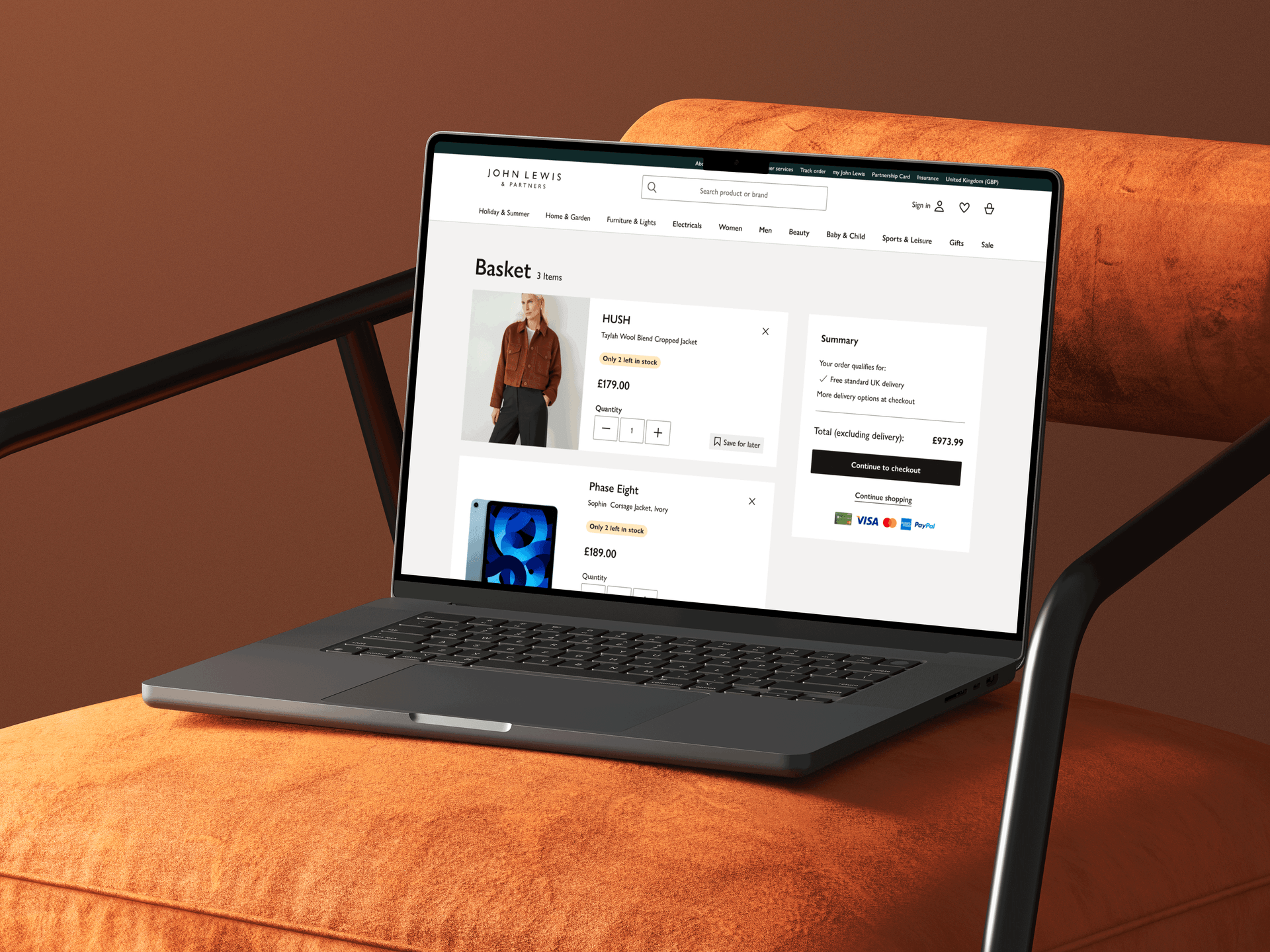
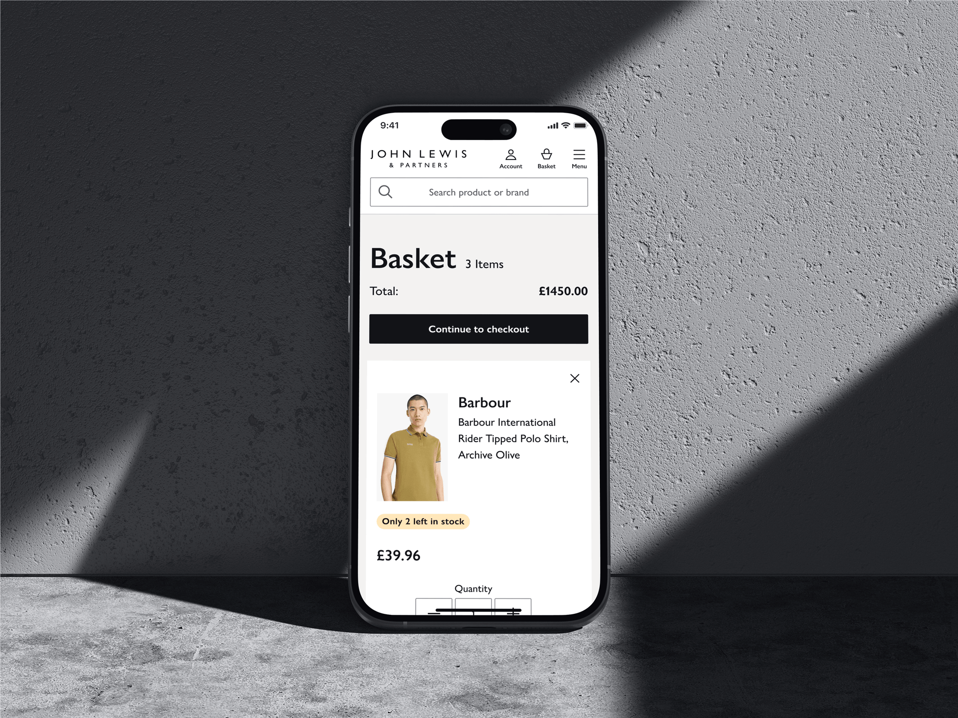
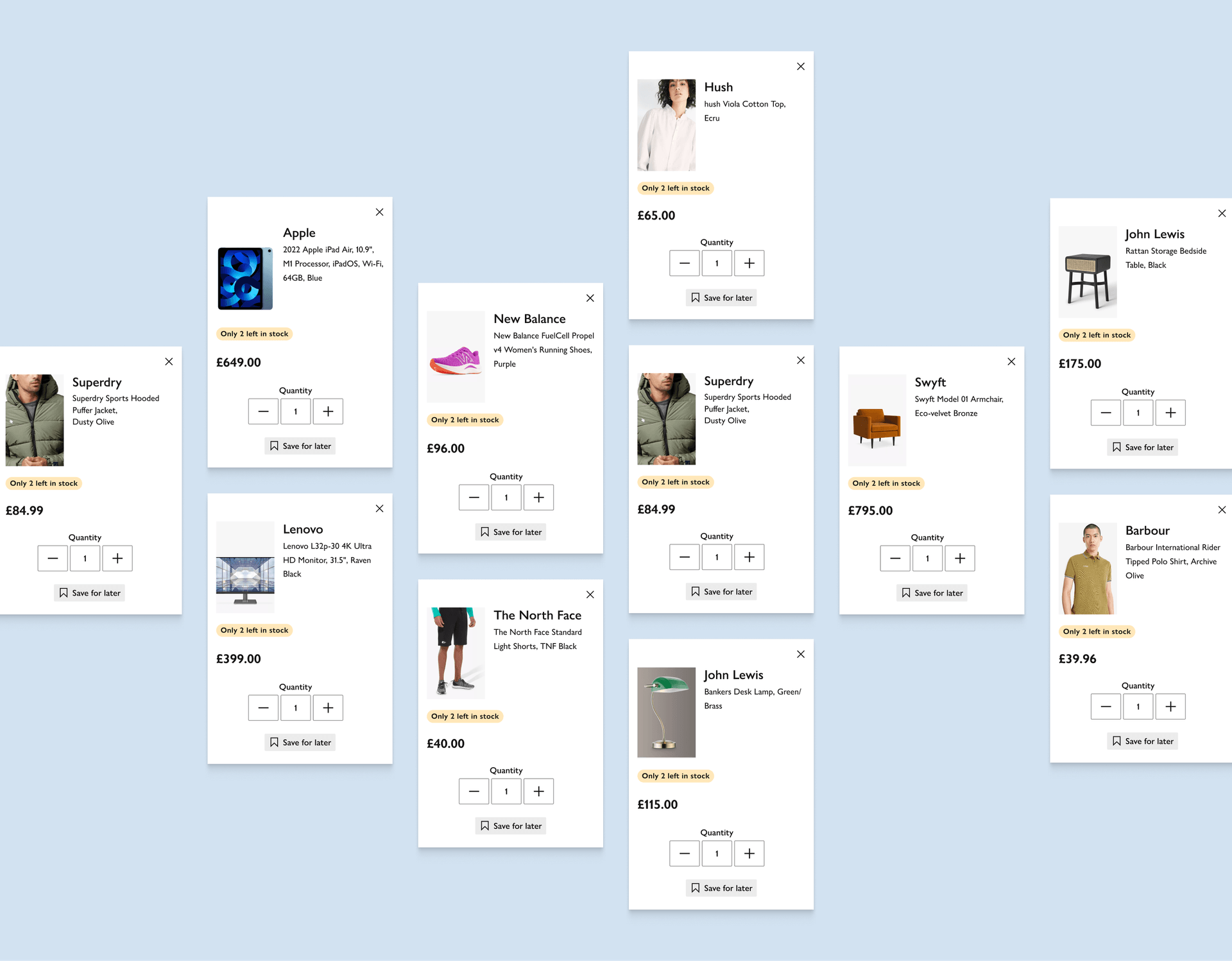
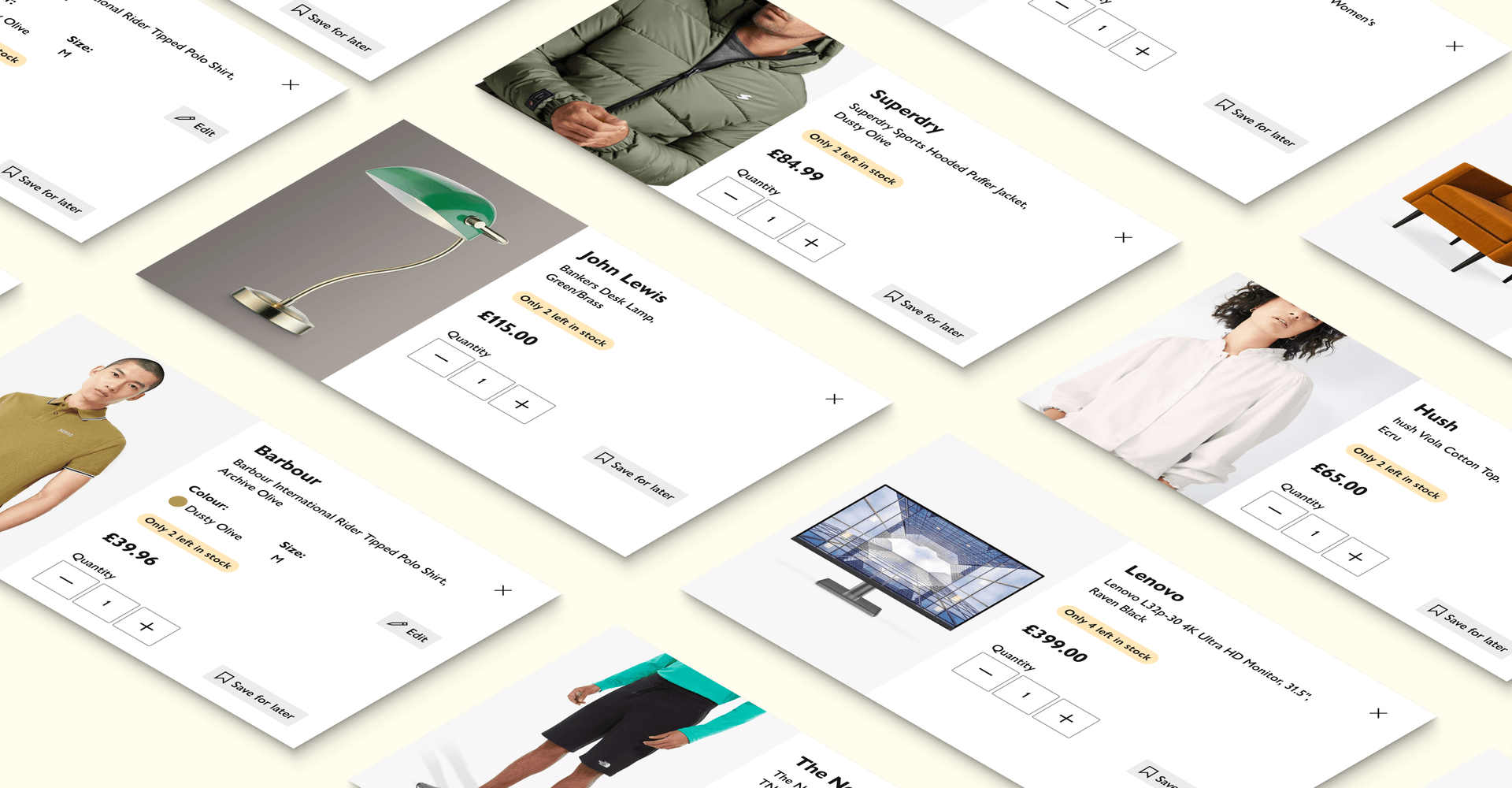
Improving visual hierarchy on product cards
Establishing the right information hierarchy at product card level allows customers to easily scan informations and make a quicker confident decision and move forward to checkout. Resulting in higher conversion.
Dialling-up on urgency
Leveraging the design system badge component to display the stock availability, increases the visual hierarchy of the low stock availability, generating urgency and potentially increasing conversions.
Adhere to accessibility standards
Adhering to the latest web accessibility standards, we made sure the redesigned basket cards were usable for individuals with disabilities, promoting inclusivity.
Responsive design
Optimising the card component layout is optimally presented on all viewports.
Accessibility
Adhering to the latest web accessibility standards, we made sure the redesigned basket cards were usable for individuals with disabilities, promoting inclusivity.
Impact
Following the product card redesign, we observed the following improvements:
Increased engagement:
Users spent more time on the shopping basket page, indicating enhanced interest and engagement.
Decreased basket abandonment:
The improved design and prominent calls-to-action led to a reduction in basket abandonment rates.
Conversion rate boost:
A slight increase in users proceeding to checkout resulted in a higher overall conversion rate.
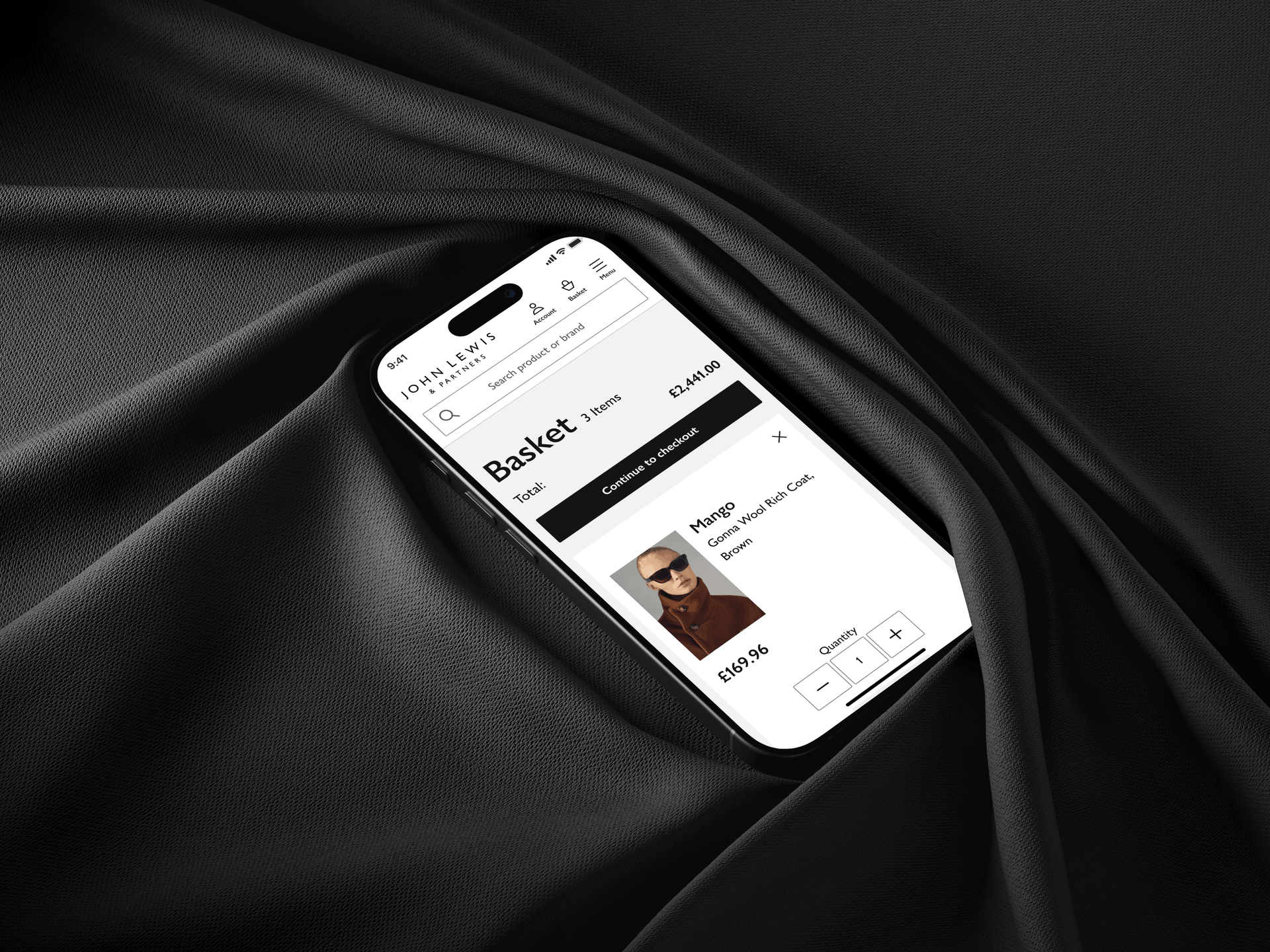
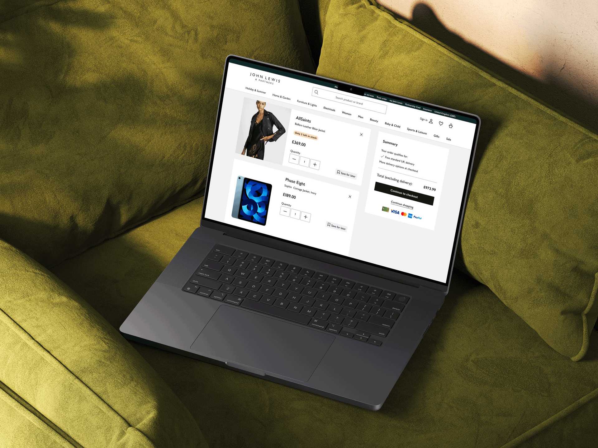
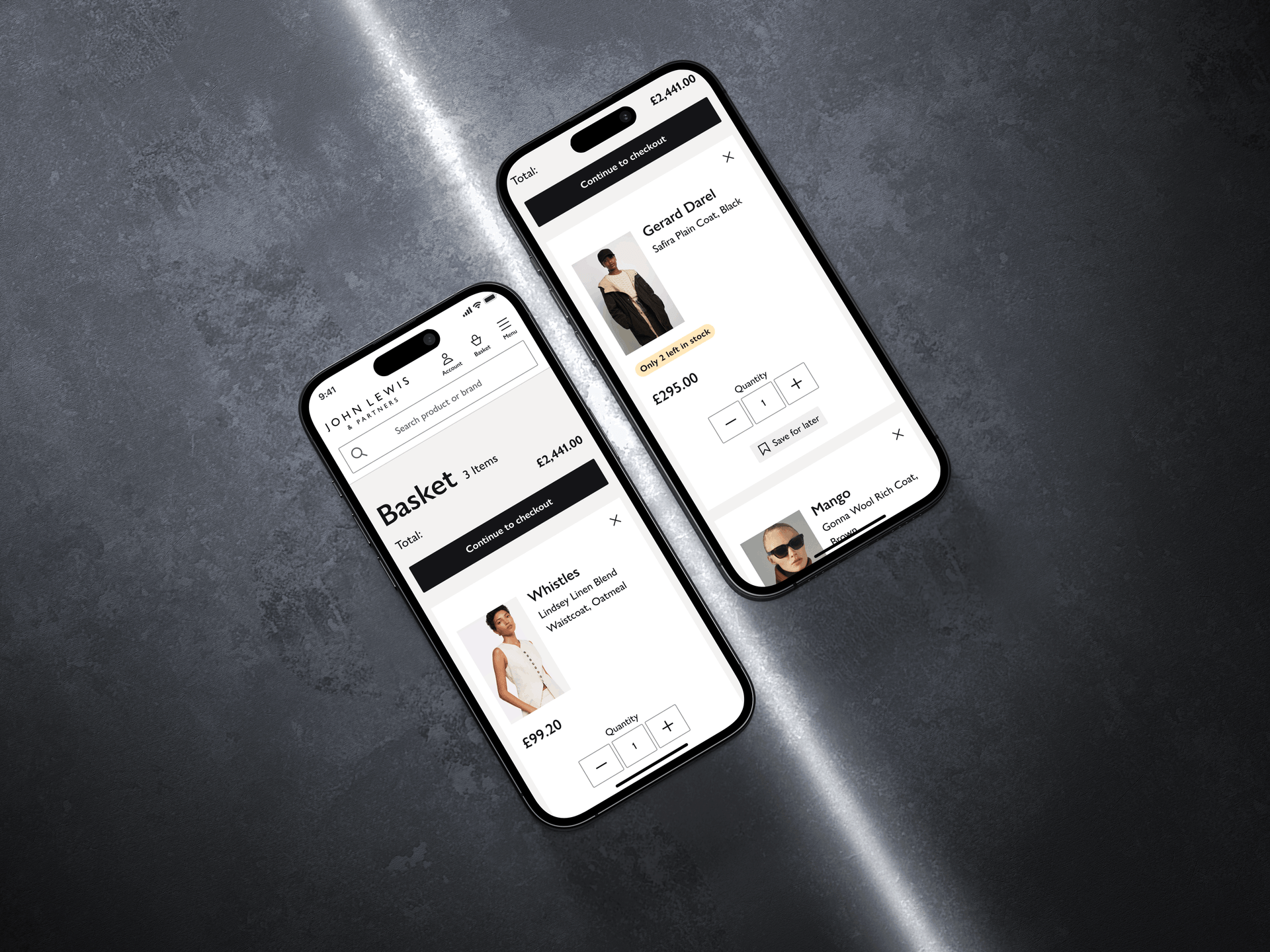
Putting customer in control — Product editing functionality
Offering users the ability to modify product attributes like size and colour directly within the shopping basket facilitates the user flow proceeding to the checkout and improves the overall user experience. This eliminates the need for users to navigate back to the product page if they realise they've selected the wrong variant. It's a key part of a well-designed e-commerce flow that anticipates user needs and reduces friction.
What's next?
optimising the shopping basket experience is a long-term strategic endeavour that goes beyond simple A/B testing. It involves a continuous cycle of data analysis, technological adoption, and a deep understanding of evolving customer behaviors and business needs.
mid-to-long-term strategy
Focusing on building a basket experience that is not only efficient but also highly personalised, intelligent, and seamless across all channels.
To do...
Explore ways of bringing personalisation into the customer experience. Leveraging data and customer preferences from all touchpoints.
