John Lewis & Partners
Optimising the basket experience
Work
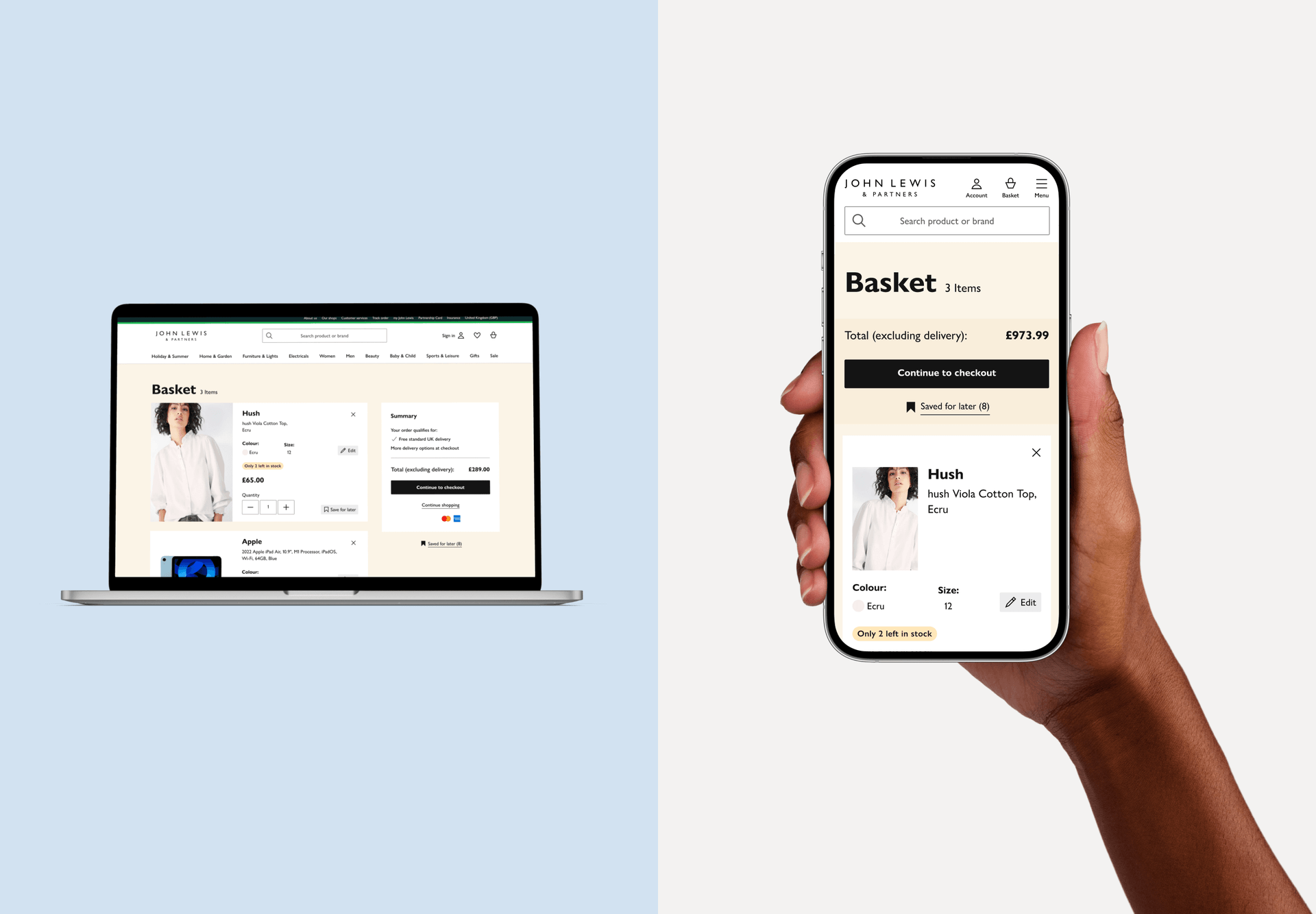
Impact
Impact
Conversion rate: +0.7%
New visitor conversions: +1.2%
Continue to checkout: +0.6%
Basket abandonment: -0.4%
My role:
Lead UX/UI
Prototyping
Interactions
Introduction
At John Lewis & Partners, our mission is clear: to provide an unparalleled shopping experience. This case study details the journey of optimising our basket experiencere for our customers. The goal was to enhance user engagement, streamline the shopping process, and boost conversions.

the audience
Knowing our customers
Identifying our users was crucial to understanding their needs. We categorized them into three primary groups:
Casual shoppers (Browsers)
They contribute significantly to store traffic but are less likely to make purchases. These browsers often abandon carts or return products, typically engaging in low-revenue transactions and demonstrating a lack of brand loyalty.
Researcher-orientated shoppers
Meticulous and thorough researchers, particularly in high-priced categories, they invest significant time comparing products across brands to make informed decisions.
Bargain hunters
Price-conscious shoppers focused on finding the best deals and lowest prices, they are willing to explore multiple stores to secure the most favorable options.

User struggles
The Pain Points
Customers encounter several frustrating limitations in the current online shopping journey, such as incomplete product information and limited editing functionality within the basket.
Incomplete Information
To find complete product details, customers were forced to leave the shopping basket, a disruptive step that could lead to cart abandonment.
Limited Editing Functionality
The inability to modify product choices directly within the basket frustrated users, forcing them to start over if they needed to change size, color, or quantity.
Decision-Making Challenges
Insufficient product information led to indecision, preventing users from making quick and confident purchases.
The Problem
Our data revealed a crucial issue: users frequently left the shopping basket to seek additional product information, leading to increased cart abandonment and lower conversion rates. This obstacle highlighted the existing product cards' shortcomings. They lacked the detailed information or editing capabilities that customers needed to make confident purchasing decisions directly from the basket. Our mission was clear: validate customer concerns and design a solution that would provide all necessary information and functionality within the basket, ensuring a seamless and satisfying shopping experience.
HMW
How might we?
Is a great question format used in design thinking to brainstorm solutions.
How might we...
create a seamless shopping basket experience that minimizes navigation by presenting all essential information at a glance?
How might we...
present comprehensive product details (descriptions, specifications, reviews) within the basket to enhance customer confidence and satisfaction?
How might we...
create a basket interface that minimizes customer effort and maximizes convenience by providing all the necessary information and intuitive editing features, ultimately leading to a higher purchase completion rate?
How might we...
optimize the shopping basket experience by prioritizing customer needs for clear product information and effortless editing functionalities, ultimately boosting conversion rates.
How might we...
Increase basket efficiency by allowing customers to effortlessly modify their selections (size, color, quantity) directly within the basket, ultimately leading to a smoother checkout process.
Industry benchmark
Advice from Baymard institute
is a leading authority on e-commerce user experience. They offer a wealth of resources to help businesses improve their online stores and increase conversion rates.
Enhance basket clarity by featuring large product thumbnails and displaying core product specifications directly within the basket. This allows customers to easily identify and review their selections at a glance
Increase basket efficiency by enabling customers to effortlessly switch between product variations (size, color, etc.) directly within the basket. This promotes a smoother checkout process and minimizes errors.
Idea
Hypothesys formulation
Placing customers in control of their shopping experience is key. By integrating detailed product information and advanced editing functionalities within the shopping basket, we can empower them to make quick, informed decisions and modify selections with ease.
User story
As an online shopper, i want to access detailed product information and modify my product choices directly within the basket, so that I can make informed decisions and efficiently manage my selections without leaving the basket interface.
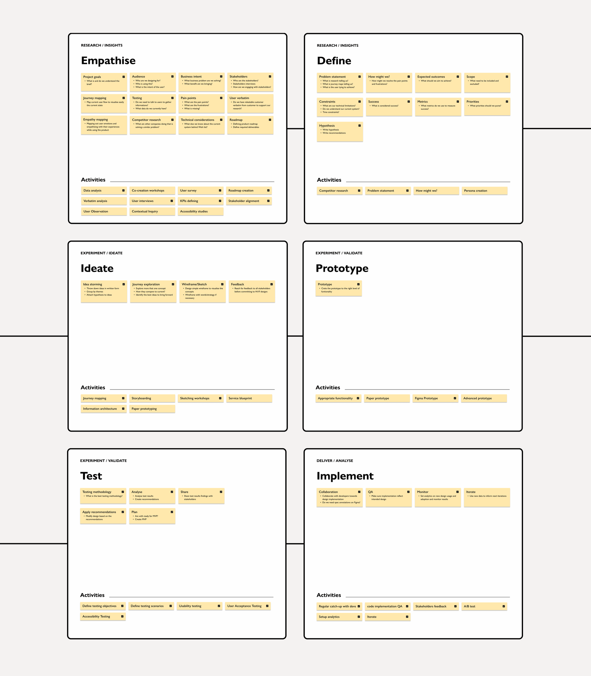
Goal
The Solution
Having identified key user pain points, I designed a solution that directly addresses these friction points, creating a smoother shopping experience.
Improved product information
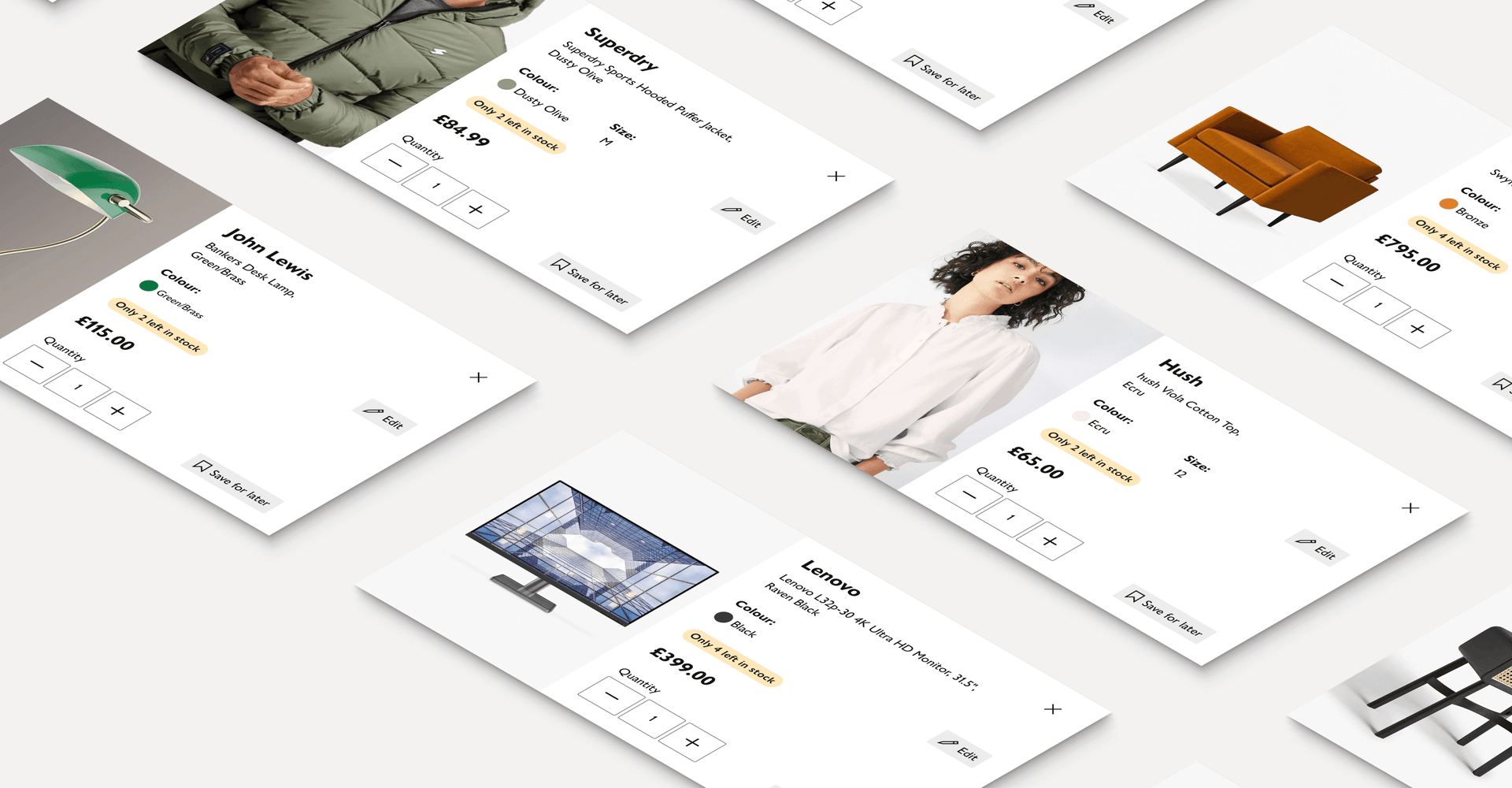
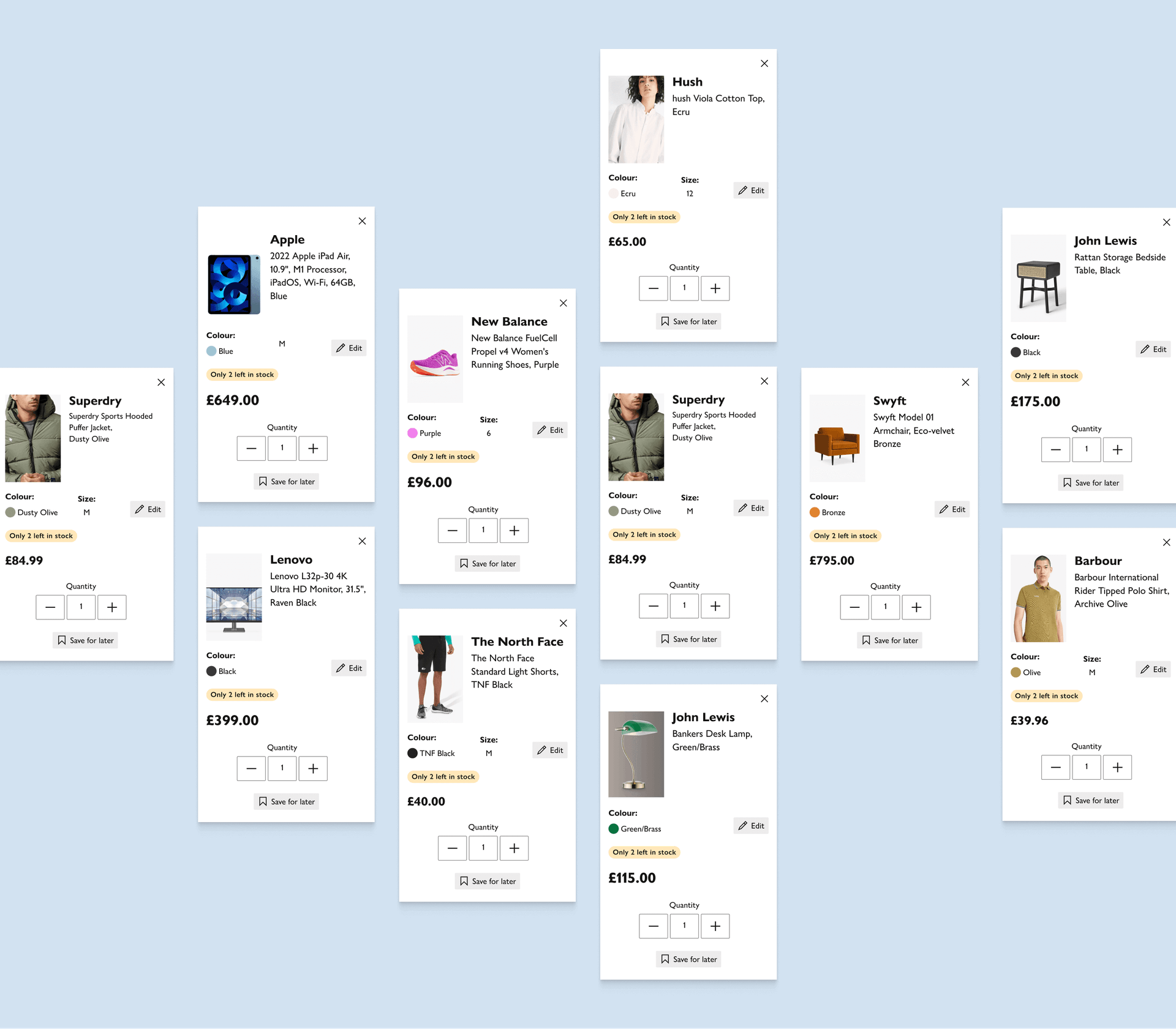
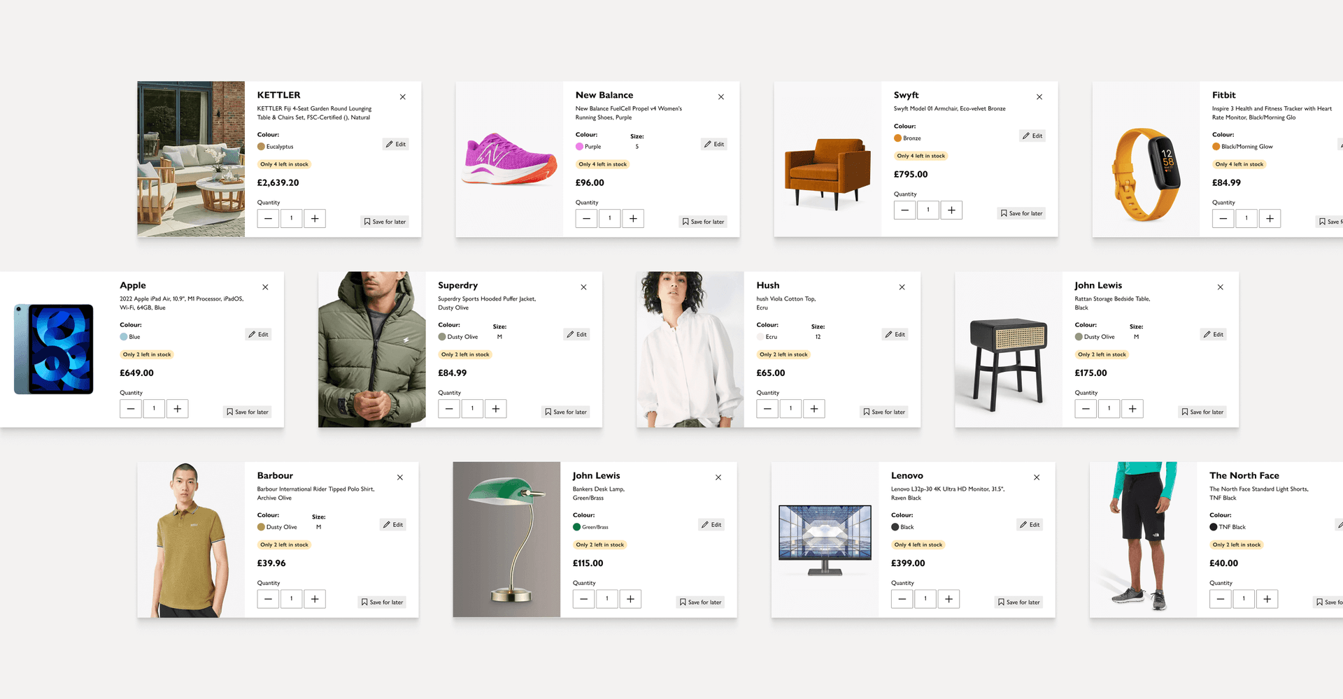
Enriched the product cards with comprehensive details, including size, color options, availability, and customer reviews. This enhancement ensured that users had all the necessary information at their fingertips, reducing the need to navigate away from the basket.
Enhanced editing functionality
Integrated features that allowed users to modify product attributes such as size and color directly within the basket. Additionally, we introduced options to add product variants, streamlining the decision-making process.
Visual enhancement (UI)
By redesigning the visual elements, we created engaging and effective displays. The new design showcased product images, descriptions, and prices in an attractive, user-friendly manner.
Streamlined user experience
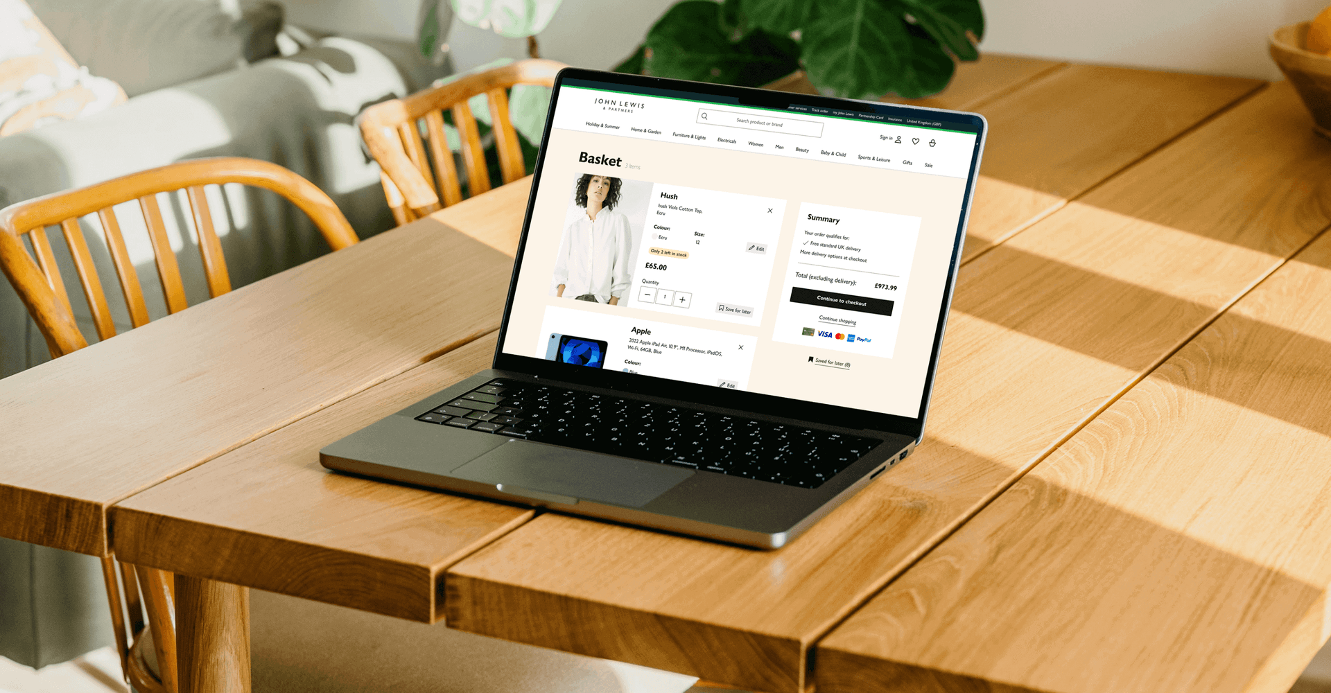
We optimised the layout to ensure clear navigation and minimized steps for viewing and managing basket contents. This redesign aimed to reduce frustration and enhance the overall shopping journey.
Responsive design
Recognising the rise in mobile usage, we ensured the redesigned basket cards were mobile-optimized. This consistency provided an enjoyable user experience across all platforms.
Accessibility
Adhering to the latest web accessibility standards, we made sure the redesigned basket cards were usable for individuals with disabilities, promoting inclusivity.

A/B tested
Engagement
Abandonment
Conversions
Impact
Following the product card redesign, we observed the following improvements:
Increased engagement:
Users spent more time on the shopping basket page, indicating enhanced interest and engagement.
Decreased basket abandonment:
The improved design and prominent calls-to-action led to a reduction in cart abandonment rates.
Conversion rate boost:
A slight increase in users proceeding to checkout resulted in a higher overall conversion rate.
Closing the loop
What are the next steps?
Our commitment to continuous improvement involves closely monitoring key metrics like click-through rates, conversion rates, and time spent on product pages. Analyzing these insights will guide future enhancements to optimize the shopping experience for our users
Back to top
