MVF Global
Multi brand design system
Work
Impact
Impact
+ Accelerated time-to-market
+ Enhanced brand cohesion
+ Heightened consistency
+ Optimized efficiency
- Reduced operational costs
My role:
Lead UX/UI
What challenge are we facing?
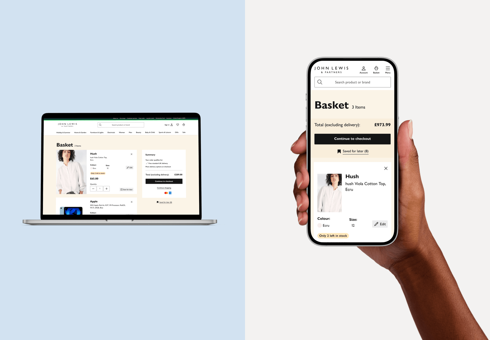
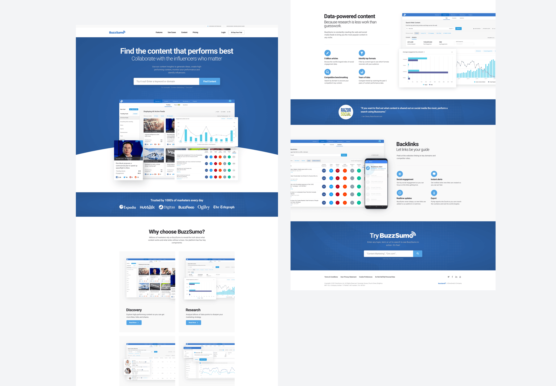
We are confronted with the task of creating a cohesive design system for a multi-brand organization, which proves to be a intricate undertaking requiring the synchronization of diverse design elements, processes, and procedures across various brands. The key objective is to achieve uniformity in branding by implementing a shared set of design guidelines across all brands, while still preserving their distinct identities.
Stakeholders
Designers
Developers
Product Managers
UX Designers
UX Researchers
UX Writers
Leadership
Accessibility
Assembling the team
Accurately identifying stakeholders is crucial to ensuring that their requirements, expectations, and concerns are taken into account throughout the project's lifecycle. Here are the stakeholders for our design system:
Designers:
They are responsible for creating and maintaining the design system components, ensuring consistency and alignment with the overall design principles.
Developers:
Developers implement the design system components in the actual codebase. They play a crucial role in making sure the design system is technically feasible and integrates well with the development environment.
Product Managers:
Product managers oversee the strategic development, coordination, and evolution of design systems, ensuring alignment with organizational goals, effective collaboration among teams, and responsiveness to user needs.
UX Designers/Researcher:
UX designers create and refine design system components for consistency and usability, while UX researchers conduct testing and analysis to ensure user-friendliness and accessibility.
UX Writers:
Those responsible for creating content need to work closely with the design system to ensure that the language and tone are consistent across the product.
Executives/Leadership:
Leadership is involved in setting the overall strategy and priorities for the organization. They need to be aware of how the design system contributes to the company's goals and brand identity.
Accessibility Experts:
Ensuring that the design system is accessible to users with diverse abilities is crucial. Accessibility experts may be involved in reviewing and advising on the design system to make it inclusive.
Process
Purpose and Scope
Audit
Team
Design Principles
Components
Documentation
Governance
Mixing all the ingredients
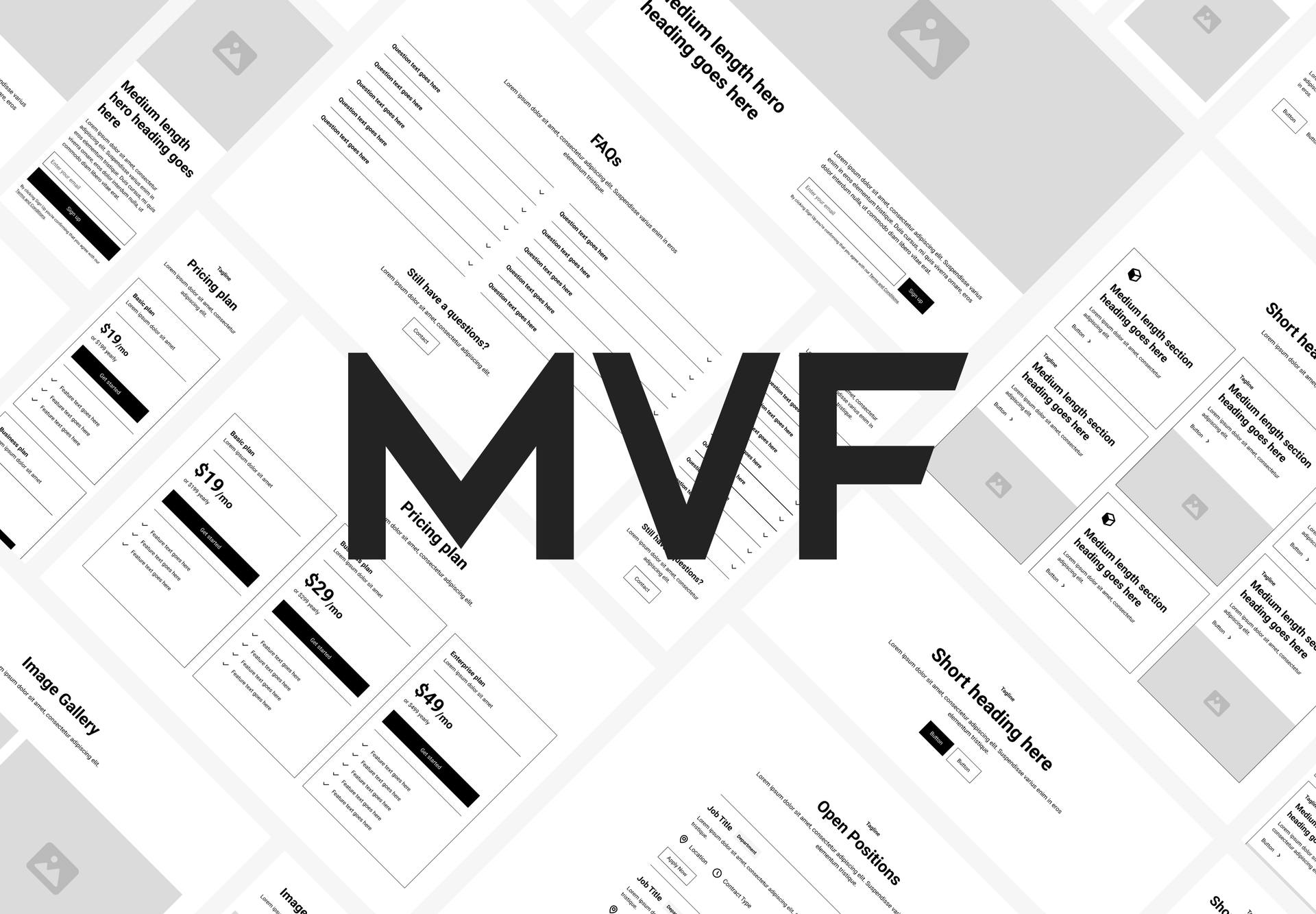
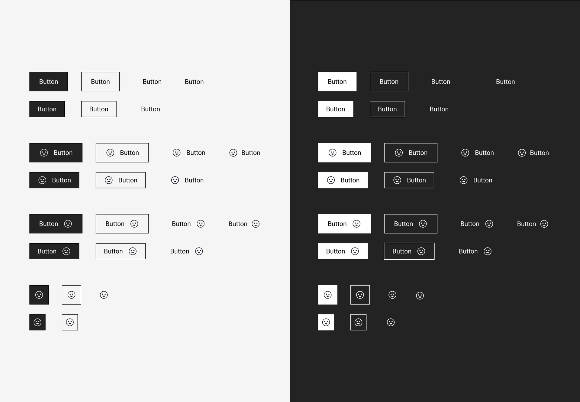
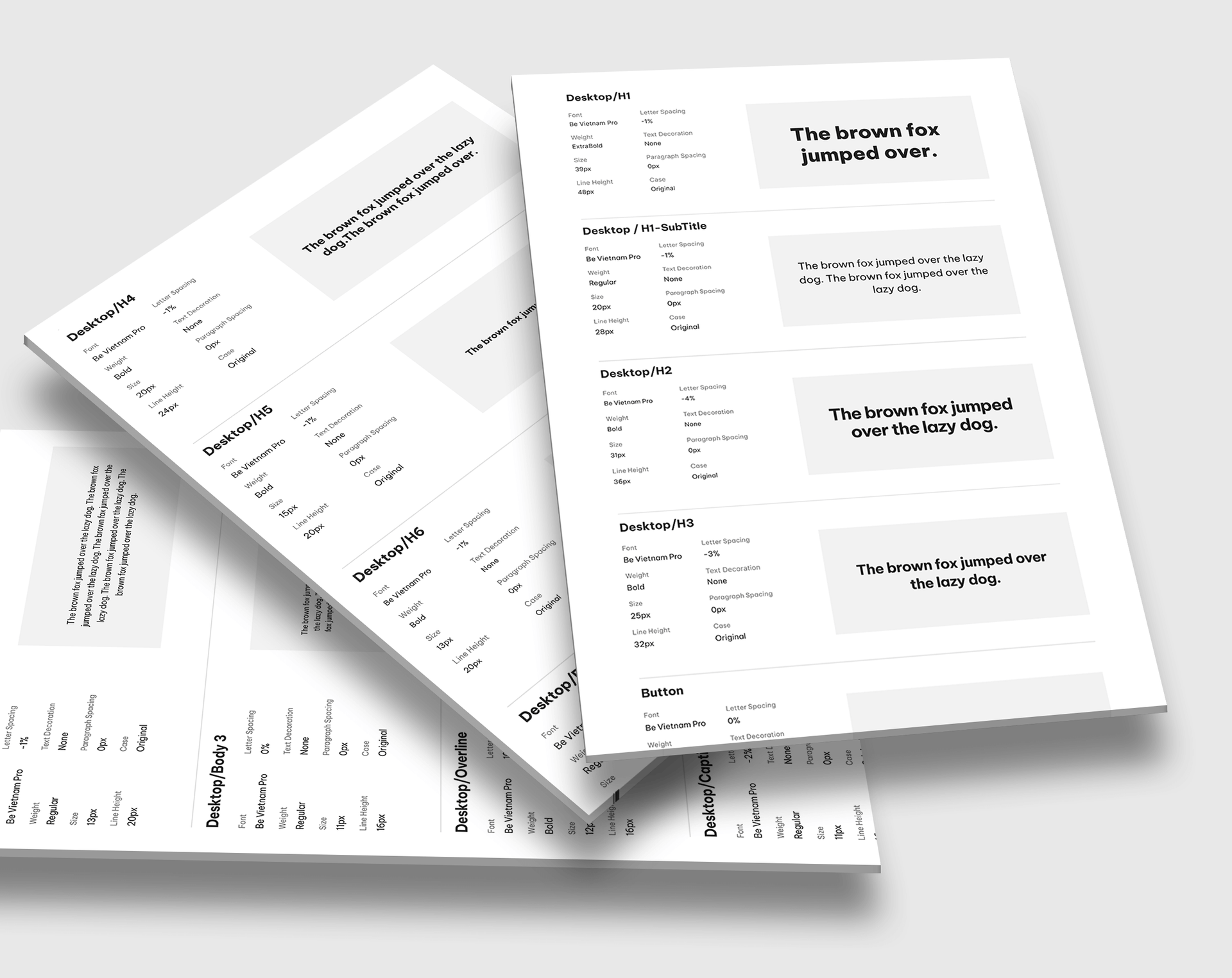
To initiate the design system development, we start by clearly defining its purpose and scope, outlining goals, and specifying the platforms, devices, and components it will encompass. Conduct a thorough design audit, researching industry best practices and gathering input from stakeholders, designers, and developers to understand their requirements. Form a cross-functional design system team, ensuring representation from various departments to capture diverse perspectives. Establish guiding design principles aligned with organizational goals and the desired user experience. Identify and design key components with a focus on buttons, typography, forms, and navigation, maintaining consistency in visual language, interaction patterns, and usability. Develop comprehensive documentation containing guidelines, code snippets, design specifications, and usage examples. Collaborate closely with developers to implement the design system in code, ensuring responsiveness and accessibility of components. Implement a governance model to manage updates, contributions, and changes to the design system, defining roles and responsibilities for its maintenance and evolution. Regularly iterate and update the design system to accommodate changes in technology, design trends, and user needs, recognizing its dynamic nature.
Define purpose and scope
Research and audit
Create a design system team
Establish design principles
Design components
Create documentation
Develop and code
Implement governance
Iterate and update
Solution
Global library
Brand libraries
The Resolution
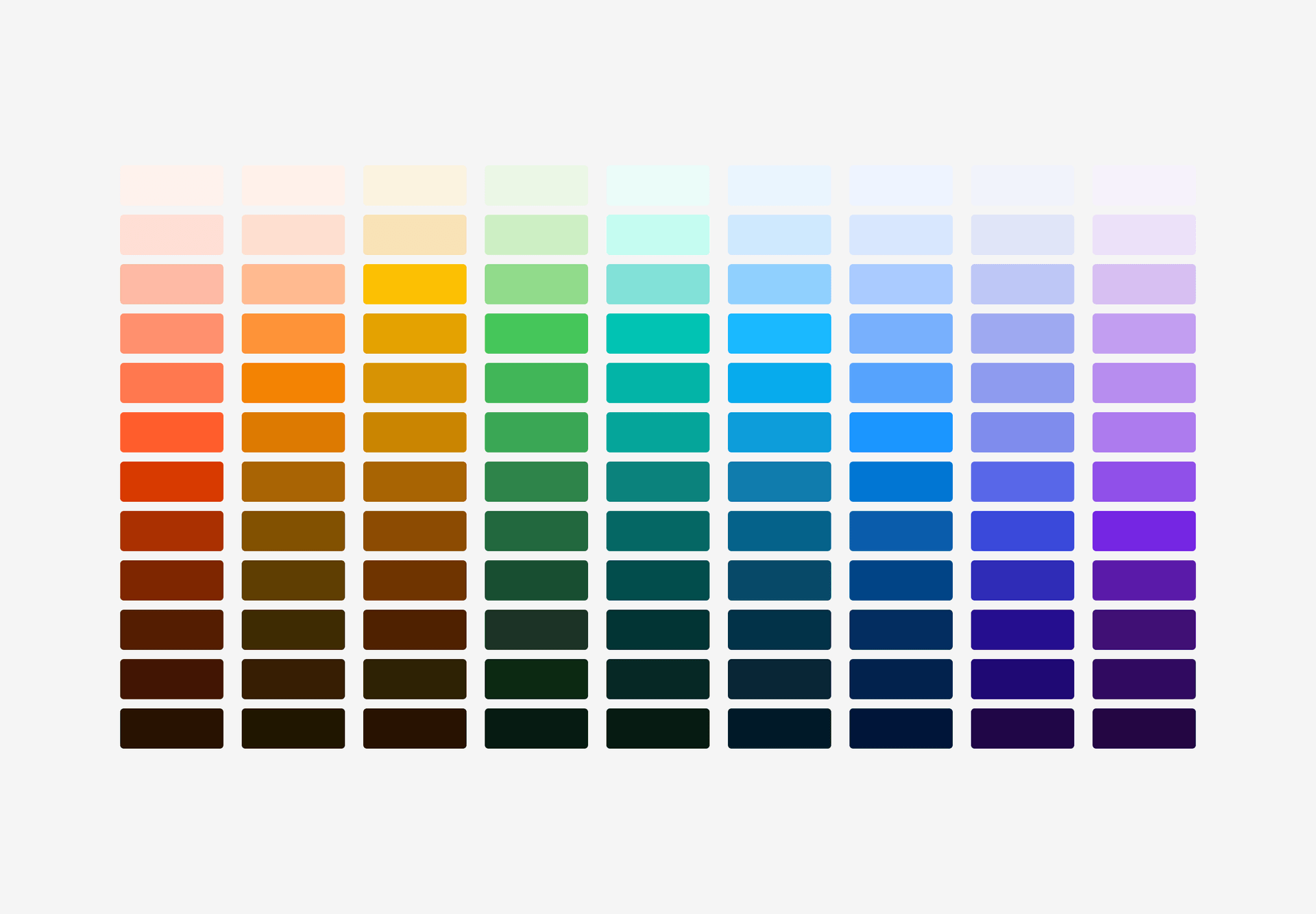
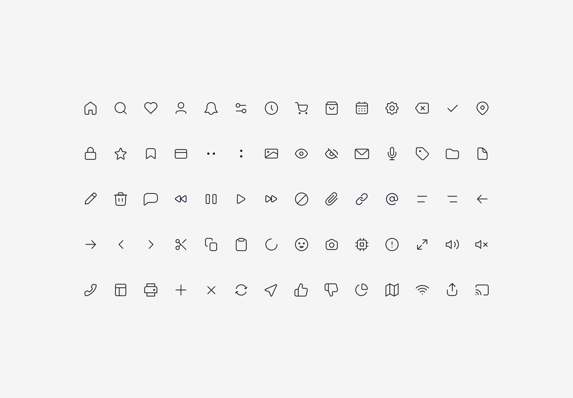
Building a multi-brand design system involves crucial components such as a universal component library, design principles that transcend individual brands, brand-switchable libraries, and comprehensive documentation. At its core, the universal component library houses design elements applicable across all brands. Design principles that transcend individual brands establish a uniform visual language. Global stylesheets provide neutral, customizable styling rules. Brand-switchable libraries accommodate brand-specific elements like logos and colors, enabling effortless transitions between brands while retaining universal components. Brand-specific components, adhering to system constraints, are customizable and documented to align with overarching design principles.
Outcome
Better UX
Consistency
Speed to market
Collaboration
What happened after implementation?
The introduction of the new multibrand design system contributed to a more successful product ecosystem by providing users with a cohesive and user-friendly experience, accelerating development cycles through reusable components. Reinforcing brand identity across platforms, easing maintenance efforts, fostering cross-team collaboration, and ensuring adaptability to evolving user expectations, ultimately leading to increased user satisfaction and overall product success.
Fostering collaboration and communication
Teams collaborate via dedicated channels, fostering communication for system maintenance. Rigorous testing ensures brand customizations don't compromise integrity. Comprehensive documentation aids teams in using and customizing components, streamlining the design process in a complex multi-brand setup.
Back to top
